font-family 設(shè)置字體名稱
可以使用多個名稱,用逗號分隔,瀏覽器則按照先后順序依次使用可用字體
p { font-family:'宋體','黑體','Arial'; }
font-size 設(shè)置字體大小
length 用長度值指定文字大小,不允許負值
percentage 用百分比指定文字大小,其百分比取值是基于父對象中字體的尺寸,不允許負值
p { font-size:14px;}
font-weight 控制字體粗細
normal 正常的字體,相當(dāng)于數(shù)字值400
bold 粗體,相當(dāng)于數(shù)字值700
100~900 定義由細到粗的字符
p { font-weight:bold;}
font-style 控制字體是否傾斜
normal 指定文本字體樣式為正常的字體
italic 指定文本字體樣式為斜體,對于沒有設(shè)計斜體的特殊字體,如果要使用斜體外觀將應(yīng)用oblique
oblique 指定文本字體樣式為傾斜的字體,人為的使文字傾斜,而不是去選取字體中的斜體字
p { font-style: italic;}
color 文本顏色
text-decoration 文本裝飾線條
none 默認。定義標準的文本
underline 定義文本下的一條線
overline 定義文本上的一條線
line-through 定義穿過文本的一條線
blink 定義閃爍的文本
p { text-decoration:overline;}
text-shadow 文本陰影
h-shadow 必需。水平陰影的位置。允許負值
v-shadow 必需。垂直陰影的位置。允許負值
blur 可選。模糊的距離
color 可選。陰影的顏色
h1{ text-shadow: 2px 2px 2px #ff0000;}
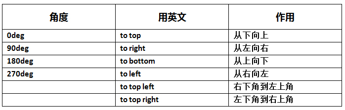
寬度 width : auto | length
高度 height : auto | length
外邊距 margin : auto | length
margin-top 設(shè)置上邊的外邊距
margin-bottom 設(shè)置下邊的外邊距
margin-left 設(shè)置左邊的外邊距
margin-right 設(shè)置右邊的外邊距
縮寫型式:
margin: 上邊距 右邊距 下邊距 左邊距
margin: 上下邊距 左右邊距
margin: 上邊距 左右邊距 下邊距
內(nèi)邊距 padding : length
padding-top 設(shè)置上邊的內(nèi)邊距
padding-bottom 設(shè)置下邊的內(nèi)邊距
padding-left 設(shè)置左邊的內(nèi)邊距
padding-right 設(shè)置右邊的內(nèi)邊距
透明度 opacity :
number值為 0.0-1.0 之間的小數(shù)
兼容全瀏覽器的寫法:
div{ filter:alpha(opacity=50); } /* IE6-IE8 */
div{ opacity:0.5; } /* 現(xiàn)代瀏覽器 */
border-style 邊框樣式
none 定義無邊框
hidden 與"none"相同。不過應(yīng)用于表時除外,對于表,hidden用于解決邊框沖突
dotted 定義點狀邊框
dashed 定義虛線
solid 定義實線
double 定義雙線。雙線的寬度等于border-width的值
groove 定義3D凹槽邊框。其效果取決于border-color的值
ridge 定義3D壟狀邊框。其效果取決于border-color的值
inset 定義3D inset邊框。其效果取決于border-color的值
outset 定義 3D outset邊框。其效果取決于border-color的值
border-top-style 設(shè)置上邊框線
border-bottom-style 設(shè)置下邊框線
border-left-style 設(shè)置左邊框線
border-right-style 設(shè)置右邊框線
border-width 邊框?qū)挾?/SPAN>
thin 定義細的邊框
medium 默認。定義中等的邊框
thick 定義粗的邊框
length 允許你自定義邊框的寬度
border-top-width 設(shè)置上邊框?qū)挾?/SPAN>
border-bottom-width 設(shè)置下邊框?qū)挾?/SPAN>
border-left-width 設(shè)置左邊框?qū)挾?/SPAN>
border-right-width 設(shè)置右邊框?qū)挾?/SPAN>
border-color 邊框顏色
transparent 默認值。邊框顏色為透明
border-top-color 設(shè)置上邊框顏色
border-bottom-color 設(shè)置下邊框顏色
border-left-color 設(shè)置左邊框顏色
border-right-color 設(shè)置右邊框顏色
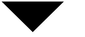
三角形
border-radius 邊框圓角
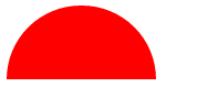
半圓
border-image 邊框圖片
設(shè)置了border-image之后,border-style則不顯示
border-image-source 用在邊框的圖片的路徑
border-image-slice 圖片邊框向內(nèi)偏移,是一個數(shù)值或百分比,不需要帶單位
border-image-width 圖片邊框的寬度
border-image-outset 邊框圖像區(qū)域超出邊框的量
border-image-repeat 圖像邊框是否應(yīng)平鋪(repeated)鋪滿(rounded)拉伸(stretched)
box-shadow 盒子陰影
h-shadow 必需。水平陰影的位置。允許負值
v-shadow 必需。垂直陰影的位置。允許負值
blur 可選。模糊距離
spread 可選。陰影的尺寸
color 可選。陰影的顏色
inset 可選。將外部陰影(outset)改為內(nèi)部陰影
使用方法:box-shadow : X軸偏移量 Y軸偏移量 [陰影模糊半徑] [陰影擴展半徑] [陰影顏色] [投影方式];
line-height 設(shè)置行間的距離(行高)
p { line-height:25px;}
p { line-height:150%;}
text-indent 規(guī)定文本塊中首行文本的縮進
p { text-indent:2em;}
text-align 規(guī)定元素中的文本的水平對齊方式
left 把文本排列到左邊
right 把文本排列到右邊
center 把文本排列到中間
justify 實現(xiàn)兩端對齊文本效果
letter-spacing 增加或減少字符間的空白(字符間距)
p { letter-spacing:5px;}
text-overflow 規(guī)定當(dāng)文本溢出包含元素時發(fā)生的事情
clip 當(dāng)內(nèi)聯(lián)內(nèi)容溢出塊容器時,將溢出部分裁切掉
ellipsis 當(dāng)內(nèi)聯(lián)內(nèi)容溢出塊容器時,將溢出部分替換為(...)
text-overflow只是用來說明文字溢出時用什么方式顯示,要實現(xiàn)溢出時產(chǎn)生省略號的效果,還須定義強制文本在一行內(nèi)顯示(white-space:nowrap)及溢出內(nèi)容為隱藏(overflow:hidden),只有這樣才能實現(xiàn)溢出文本顯示省略號的效果
word-wrap 允許長單詞或url地址換行到下一行
normal 允許內(nèi)容頂開或溢出指定的容器邊界
break-word 內(nèi)容將在邊界內(nèi)換行。如果需要,單詞內(nèi)部允許斷行
background-color 背景顏色
transparent 默認。背景顏色為透明
gradient 漸變色彩
css3 gradient分為線性漸變(linear)和徑向漸變(radial)
background-image:linear-gradient(to left, red 30%,blue);
background-image 背景圖片
body { background-image:url(images/bg.gif);}
background-repeat 背景平鋪方式
repeat 默認。背景圖像將在垂直方向和水平方向重復(fù)
repeat-x 背景圖像將在水平方向重復(fù)
repeat-y 背景圖像將在垂直方向重復(fù)
no-repeat 背景圖像將僅顯示一次
background-position 背景圖像定位
body { background-position:left bottom;}
body { background-position:30% 20px;}
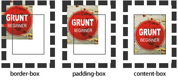
background-origin 背景原點
設(shè)置元素背景圖片的原始起始位置。必須保證背景是background-repeat為no-repeat此屬性才會生效
規(guī)定background-position屬性相對于什么位置來定位
padding-box 背景圖像相對于內(nèi)邊距框來定位
border-box 背景圖像相對于邊框盒來定位
content-box 背景圖像相對于內(nèi)容框來定位
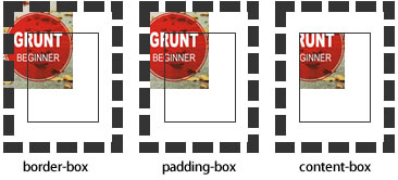
background-clip 背景的顯示區(qū)域
設(shè)定背景圖像向外裁剪的區(qū)域
border-box 背景被裁剪到邊框盒
padding-box 背景被裁剪到內(nèi)邊距框
content-box 背景被裁剪到內(nèi)容框

【 微信掃一掃 】


